Brand Identity Design & Website Development
The Master Cycle Mechanics Association (MCMA) was established to bridge the gap between cycle mechanics and the wider cycling industry, providing a hub for professional development, training, and industry connections. However, as a new organization, MCMA needed a strong brand identity and a professional website to establish credibility, attract members, and communicate its mission effectively.
Our Approach
At More than Branding, we understood that MCMA required a brand presence that conveyed professionalism, trust, and expertise while remaining approachable to mechanics at all levels. Our solution included:
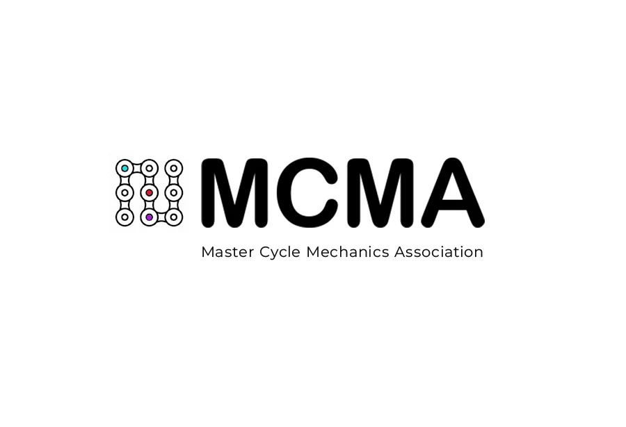
- We created a clean, modern logo with a strong, mechanical aesthetic to reflect the industry. The color palette was carefully chosen to balance professionalism with a sense of community.
- A structured yet approachable font set was selected to ensure clarity across all brand materials.
- From membership certificates to social media graphics, we provided a cohesive visual toolkit to ensure MCMA maintained a consistent identity across all platforms.
Website design and development
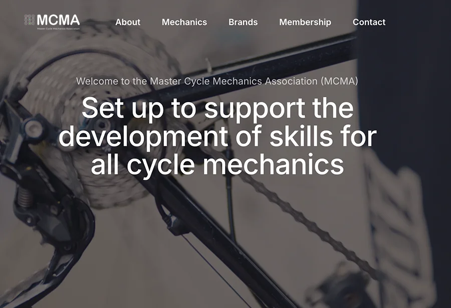
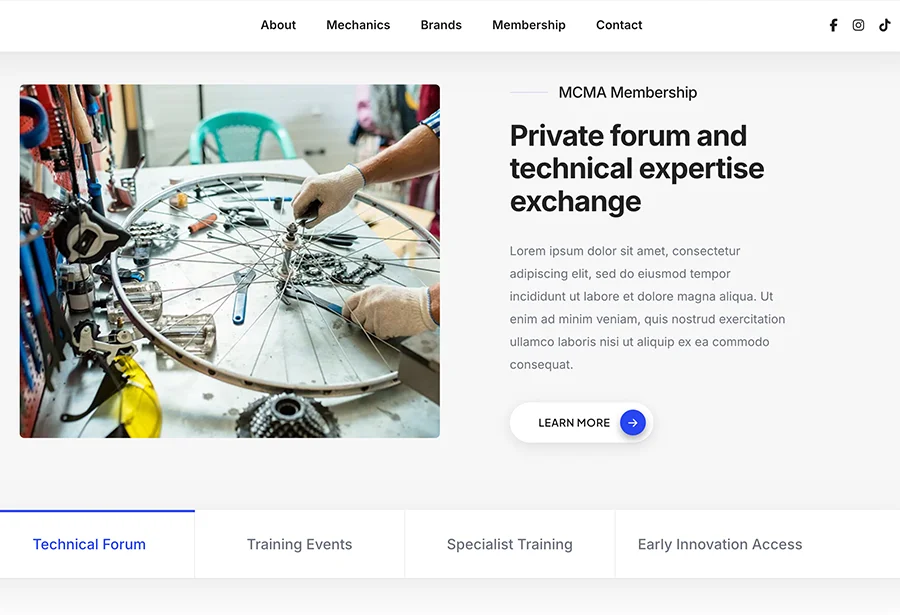
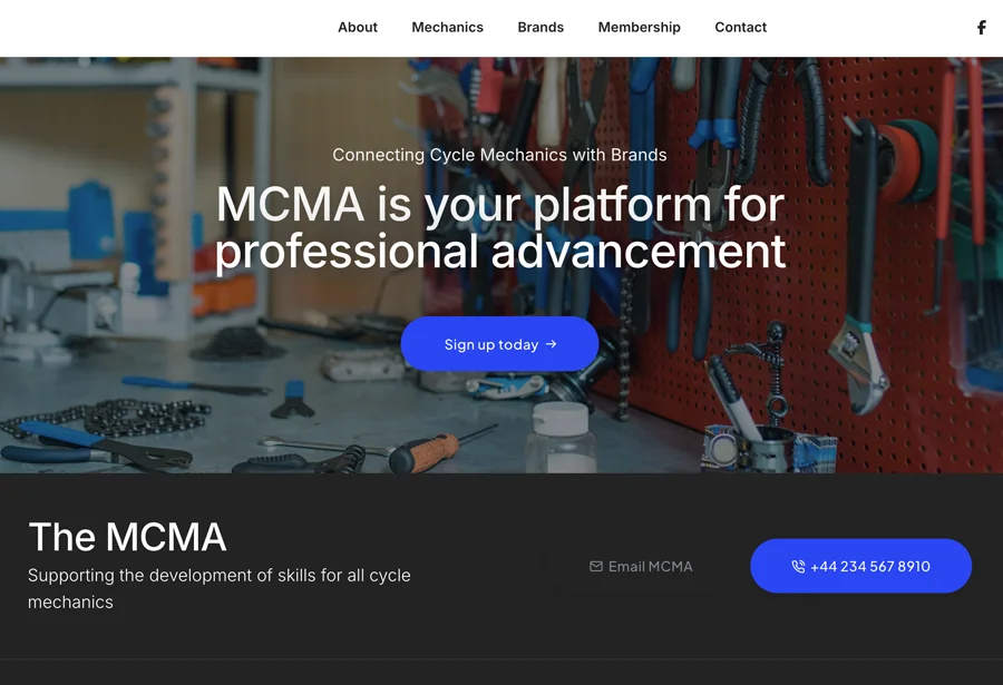
We built an intuitive and visually engaging website, ensuring seamless navigation for mechanics, training providers, and industry partners. Membership Portal for mechanics to sign up, manage their profiles, and access exclusive resources. Training & CPD Hub showcasing accredited courses and industry-recognised qualifications. A mobile responsive design and SEO optimised design to ensure accessibility across all devices and visibility on search engines.


Branding Approach
A refined and modern logo incorporating clean, professional typography with an icon that represents land, infrastructure, and precision. Sophisticated and natural colour scheme, such as deep blues and earthy greens, to reflect trust, stability, and Helios’ connection to land and infrastructure, with a professional yet approachable typeface that enhances readability across all digital and print media.

Outcome
The new MCMA brand identity and website positioned the association as a trusted authority in the industry. Since launch, MCMA has seen an increase in membership sign-ups, enhanced engagement with training providers, and growing recognition within the cycling sector.